When I first started painting, I used my reference photographs as a kind of bridge between blank canvas and finished painting, keeping the composition and design unaltered. Back then, I would work directly from a photograph without editing or adding from my own imagination.
Today, 20 years later, I've put aside that way of converting photos directly into a painting. These days I try to use my photography as a starting point in the painting process rather than the blueprint from which my paintings are copied.
I started this blog post with the idea of providing an outline of how I use reference photos. It took a few weeks of writing before I realized that this was a hopeless idea. Instead, this blog shows some of my recent work—all painted from reference photos—with a description of how I tried to get beyond the photo in each case.
The paintings progress in order from least deviation from the reference material through to almost complete invention.
If you want to take these topics further for portrait work, you can read it in conjunction with the notes on developing ideas and creating designs in my book Painting Animals in Oil. For landscapes you could read in conjunction with my blog posts on handling greens and painting animals in the landscape. For seascapes you should also look at this post.
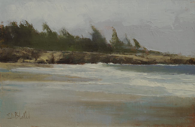
Song of the Wind. Approx. Approx. 7x11, oil on linen panel. 2021
My starting point in painting from a photograph is to find something (other than the subject) which will guide my decisions in the painting process. At this location, the prevailing wind was in my face every time I walked down to the beach and the trees on top of the rock were bent by the constant pressure. I thought it would be an effective way to tie the whole painting together.
This is based on some photos I took during a vacation on the northwest coast of Maui at the end of 2019, immediately before the pandemic and around the time when an illness came to dominate our family life.
I couldn't bring myself to paint it in bright, joyful colors. I cropped the photo and reduced the yellow and blues in the image. While painting, I desaturated the colors and simplified most of the elements. The sky is an invention.
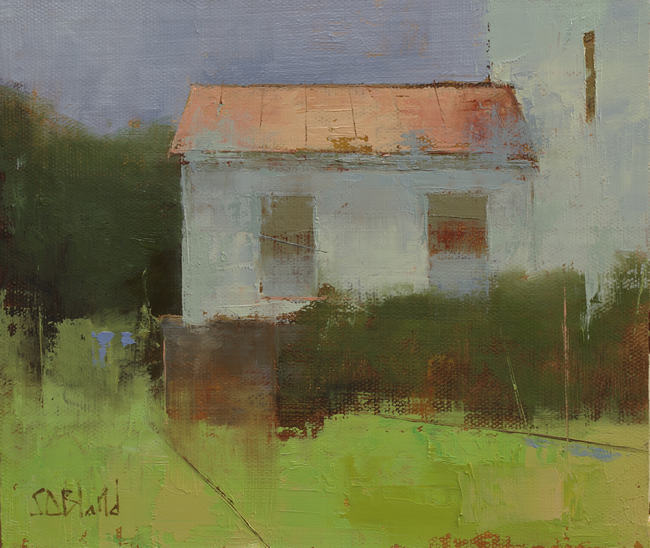
Sunnybank. Approx. 8x10, oil on linen panel. 2021
I painted this Tracy Everly inspired sketch as an exercise in simplifying forms and removing detail.
It's from a 2014 reference photo which I had left unused until now because I couldn't figure out how to turn it into a good painting. In the original photo the subject matter was less compelling, and the surrounding landscaping was dark and overgrown.
The major changes to the reference photo were to add in the bright foreground and leave out most of the extraneous landscape. In terms of the building, I like to think of the details as being obscured rather than omitted. I used a lost and found outline on some of the edges to give definition.
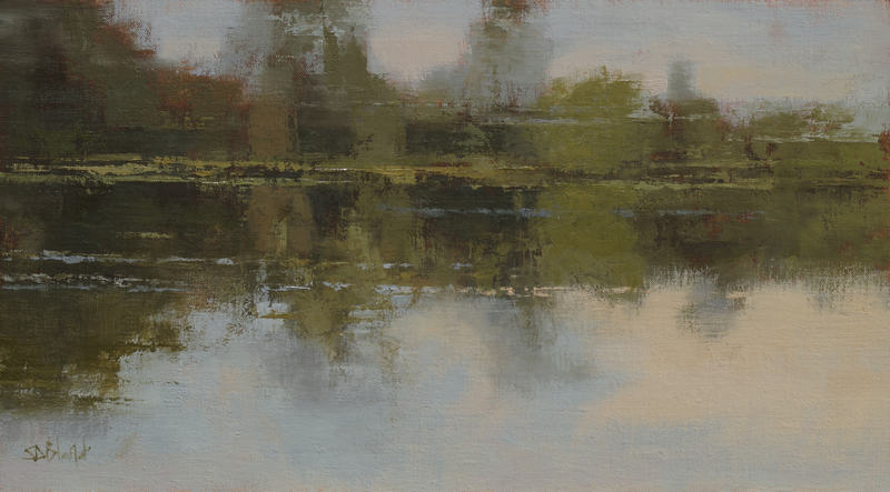
Unbroken by Oars. 9x16, oil on linen panel. 2021.
I started this with the intention of painting in an abstract, loose style. I first did a small charcoal sketch directly from my reference photo and then did the layout on the canvas using the sketch as a reference (it's a good method, honest).
My process is to step away from each painting while the first paint layer dries then return later to make sure I'm happy with the composition before finishing.
I thought I had a good start to this painting when I reached that checkpoint. But I happened to see it upside down later in the day and realized that I liked it more from this new perspective. What used to be the reflections of the trees in the water were better abstract representations of trees than my attempt to paint the actual things. I flipped the painting round and finished it the way you see it now.
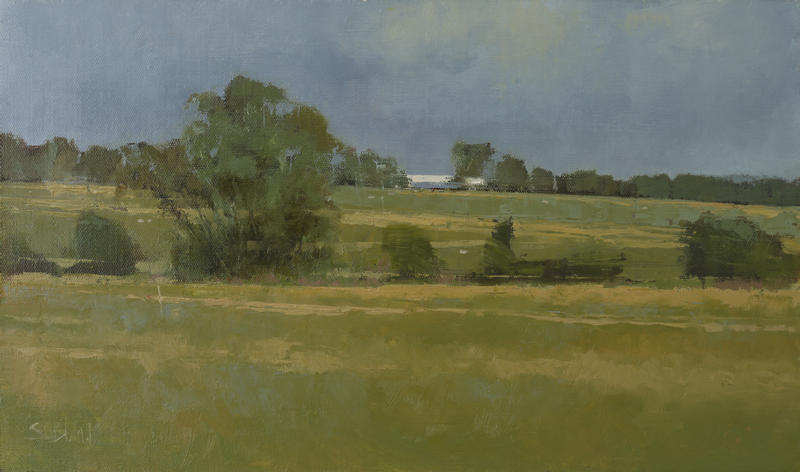
This Sceptered Isle. 11x18 3/4, oil on linen panel. 2021
This painting was inspired by a field I saw on a Google Street View which made me think of the countryside near where I spent my childhood. I was drawn to the way the land is naturally divided into fore and middle ground and I kept that division unaltered in the painting.
Most of everything else is changed from the original photo.
I simplified both tree lines and changed the color and texture of the ground. When faced with large open spaces like these, I try to fill them with patterns of values and colors since the surface of the land is equally as important as the objects it contains and areas like this need some variation.
Using separate references for the sky, I worked on it for a couple of days until I finally figured out that things looked better when it was rendered as one big dark cloud.
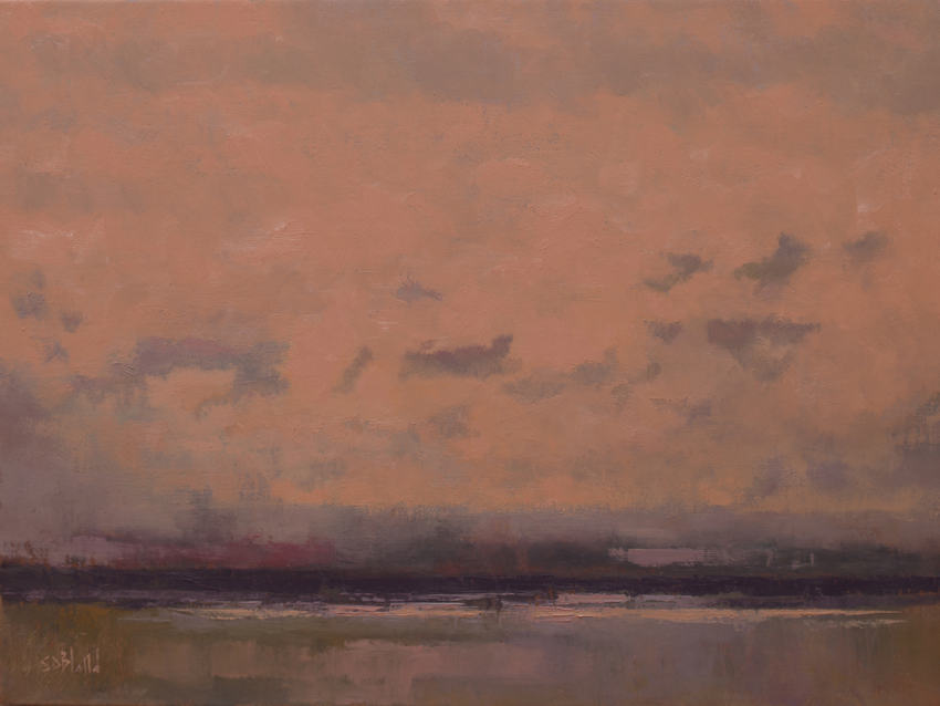
Wine Dark Sea. 16x20, oil on linen. 2019-2021
I first came across the phrase “Wine Dark Sea” (a term that originally comes from Homer) in the title of a Patrick O’Brian book, and it got stuck in my head, because it is so unusual and evocative.
When I started this painting, I’d also just finished reading The Iliad for the very first time (I had gone through a phase where I was catching up on unread classic literature) and all the ideas within it were fresh in my mind.
I had some photos I’d taken from our balcony of the skies over Elliot Bay in Seattle which had an unusual color relationship between the pink sky and purple clouds, and I wanted to use them to describe a sunset over the ocean that might evoke this mythological place. There was a lovely red color in the sky, and I got the idea that I could carry that down into the water and make it look like dark red wine.
I created this painting in 2019 and it had a more dramatic and involved sky. Although I liked the technical execution of the piece—it contained some nice impressionistic brushwork—it never seemed to fit well with the rest of the picture. After letting it sit in my studio for a couple of years, I got up the courage to sand down most of the sky and re-paint it with a simpler motif—proof that in art, as in literature, you sometimes must kill your darlings.